Understanding Email Design Fundamentals
Let’s start with the basics. Email design isn’t just about making things look pretty, it’s about creating an experience that guides readers toward taking action while building trust in your brand.
Types of Email Design
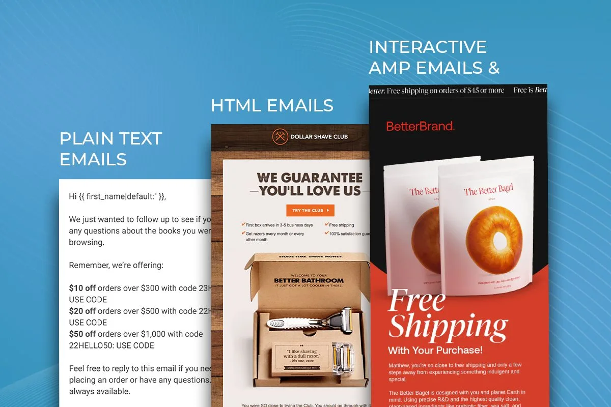
You’ve got three main approaches to choose from when designing emails and the top email marketing agencies will use a combination of all of these:
Plain Text Emails
Plain text emails feel personal and intimate. They work well for one-on-one communication and can actually stand out in a sea of graphic-heavy marketing messages. They’re simple to create, always accessible, and render perfectly on any device. The downside? You can’t include visual elements or fancy formatting to guide attention.
HTML Emails
Think of HTML emails as mini landing pages in your subscribers’ inboxes. You can include images, branded colors, multiple columns, and styled buttons. They give you complete control over the visual experience, but they require more technical skill to create and test across different email clients.
Interactive & AMP Emails
The newest kid on the block, interactive emails let subscribers take actions right inside the email, like booking appointments or completing purchases. While they offer amazing possibilities, support is still limited across email clients. Many brands use fallback versions for clients that don’t support interactivity.
Core Design Components
Now let’s break down the building blocks of great email design.
Layout Fundamentals
Your layout needs to guide readers smoothly from top to bottom. A single-column design usually works best, especially for mobile users. Keep your width around 600 pixels to ensure a good display across devices.
White space isn’t empty space, it’s breathing room. Use it strategically to separate sections and make your content easier to digest. Your readers will thank you.
Keep in mind, there’s numerous tools and plug-ins to help with image optimization for emails.
Typography That Works
Fonts do more than just convey words, they set the tone for your entire message. Stick to web-safe fonts like Arial, Helvetica, or Georgia for body text. Save the fancy fonts for headlines, and even then, use them sparingly.
A good rule of thumb: set body copy between 14-16px and headlines between 20-30px. Line spacing should be about 1.5 times your font size for optimal readability.
Color Psychology
Colors trigger emotional responses, whether we realize it or not. Blue builds trust, green suggests growth, and orange creates energy. Pick colors that match your message and brand, but don’t go overboard, two or three colors are usually enough.
Essential Email Design Elements
Every effective email has certain core elements that work together to create a cohesive experience. Let’s look at each one in detail.
Headers and Preheaders
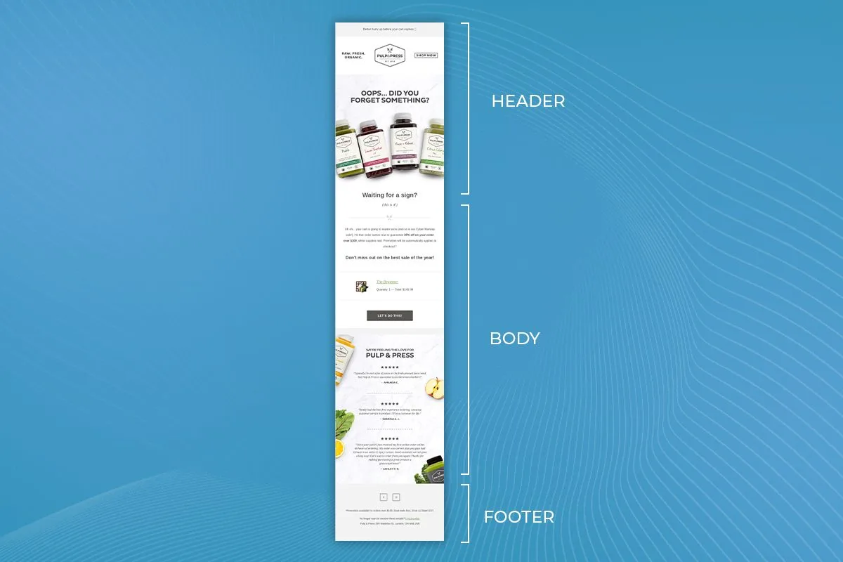
Your preheader acts like a movie trailer, it gives readers a sneak peek at what’s inside. Keep it between 40-50 characters and make it work with your subject line, not just repeat it.
A strong preheader might read: “Get your exclusive sneak peek at our spring collection” or “Members save 25% this weekend only.”
The header section should include your logo and establish your brand identity right away. Keep it clean and consistent across all your emails, you want subscribers to recognize you instantly.
Body Content That Converts
The body of your email needs to tell a story. Start with your most compelling content at the top, remember, people scan more than they read. Break up text into short paragraphs and use subheadings to guide readers through your message.
Images deserve special attention. They should support your message, not just decorate it. A few tips for using images effectively:
- Keep file sizes small for faster loading
- Include descriptive alt text
- Avoid image-only emails
- Use high-quality photos that look sharp on all devices
Your call-to-action (CTA) buttons need to stand out. Make them at least 44×44 pixels for easy tapping on mobile devices. Use action-oriented text that tells readers exactly what will happen when they click.
Footer Elements That Matter
Your footer isn’t just a legal requirement, it’s an opportunity. Include links to your social media, contact information, and privacy policy. Make your unsubscribe link easy to find, trying to hide it just frustrates people and can hurt your sender reputation.
Design Best Practices
The way people interact with email keeps evolving. Here’s what works now.
Mobile-First Design
Over half of all emails get opened on phones now so you’re making a big mistake if the email doesn’t look perfect on mobile. That means designing for mobile isn’t optional, it’s where you need to start. Some practical tips:
- Text should be readable without zooming.
- Single-column layouts work best.
- Buttons need room to breathe, no one likes clicking the wrong link because buttons are too close together.
- Test your emails on different devices. What looks perfect on your desktop might break completely on someone’s phone.
Making Emails Accessible
Accessibility makes your emails better for everyone, not just people with disabilities. Use sufficient contrast between text and backgrounds. Make sure links are underlined or otherwise clearly marked as clickable.
Don’t rely solely on color to convey meaning, use icons or text labels too. Screen readers should be able to make sense of your email’s structure through proper heading hierarchy.
Brand Consistency
Your emails should feel like a natural extension of your website and other marketing materials. Use consistent colors, fonts, and tone of voice. This builds trust and recognition over time.
Create templates for different types of emails (newsletters, promotions, transactional messages) that share common design elements while serving their specific purposes.
Advanced Design Strategies
Creating beautiful emails is just the start, you need strategies that drive engagement and conversion. Let’s explore some advanced approaches.
Personalization That Goes Beyond Names
Adding someone’s first name to an email doesn’t impress anyone anymore. Modern personalization means tailoring the entire experience to each subscriber’s preferences and behaviors.
Start with segmentation. Different subscriber groups should see different designs. A new customer might need more explanatory content with larger text and more basic layouts. A long-time customer could handle more sophisticated designs that focus on what’s new.
Use dynamic content blocks that change based on:
- Past purchase history
- Email engagement patterns
- Geographic location
- Time of day
- Device type
Think about seasonal changes too. Your summer email designs might use lighter colors and more white space, while winter emails could feature richer, darker tones that feel cozy and warm.
Interactive Elements That Work
Adding interactive elements can boost engagement rates by up to 73%, when done right. But you need to pick your battles here.
Animated GIFs remain one of the most reliable ways to add motion to your emails. They work across most email clients and can really bring your message to life. Just remember these guidelines:
- Keep file sizes under 1MB
- Limit animation to 3-5 seconds
- Make sure the first frame works as a static image
- Don’t let animation distract from your message
For more advanced interactivity, consider:
- Image carousels (with static fallbacks)
- Countdown timers for sales
- Hover effects on product images
- Basic accordion menus
Remember to always provide fallback content for email clients that don’t support these features.
AMP Email Capabilities
AMP for email opens up new possibilities for interactivity right in the inbox. Subscribers can:
- Take surveys without leaving their email
- Browse product catalogs
- Update preferences
- Make purchases
- Schedule appointments
While support for AMP emails is growing, you’ll still need regular HTML versions as fallbacks. Consider AMP for your most engaged subscribers who use supported email clients.
Popular Design Trends
Email design trends change fast, but some current trends are worth noting and implementing.
The Return of Bold Design
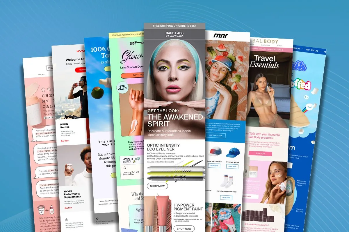
Minimalism had its moment, but bold, expressive design is back. We’re seeing:
More Color Play: Brands aren’t afraid to use bright, contrasting colors anymore. Deep, rich color palettes create emotional connections with readers. The key is maintaining readability while pushing creative boundaries.
Typography as Art: Headlines aren’t just for reading, they’re becoming design elements themselves. Large, expressive fonts grab attention and set the tone for your message. Just make sure your body text stays clean and readable.
Pattern Mixing: Geometric patterns, organic shapes, and abstract designs add visual interest without overwhelming your message. These elements work especially well as backgrounds or section dividers.
Dark Mode Design
Dark mode isn’t going anywhere. More people are using it, which means your emails need to look good in both light and dark settings.
Some tips for dark mode success:
- Use transparent PNG images where possible
- Test your logo on dark backgrounds
- Avoid pure black or white, use slightly off-shades for better contrast
- Include a dark mode specific header image when needed
AI-Generated Elements
AI tools are changing how we approach email design. They’re particularly useful for:
- Creating custom illustrations
- Generating background patterns
- Suggesting color combinations
- Optimizing layout variations
The key is using AI thoughtfully, it should enhance your design process, not replace human creativity.
Email Design by Purpose
Different types of emails need different design approaches. Understanding these distinctions will help you create more effective campaigns.
Newsletter Design That Engages
Newsletter design starts with understanding your readers’ habits. People don’t read newsletters like they read blogs or articles, they scan for interesting bits. Your design should support this behavior.
Start with a clear hierarchy. Your most important content belongs at the top where readers will see it immediately. Use headlines and subheadings to break up content into digestible sections. White space becomes your friend here, it gives readers’ eyes a place to rest and helps them focus on what matters.
Images in newsletters need special consideration. While they add visual interest, too many images can trigger spam filters or slow down loading times. Pick quality over quantity. Each image should serve a purpose, whether that’s illustrating a point or drawing attention to key content.
Remember that many subscribers will see your newsletter in their email preview pane. Design the top portion of your newsletter to grab attention even in this limited space. A compelling headline paired with an interesting image can make the difference between someone opening your email or scrolling past it.
Promotional Email Design
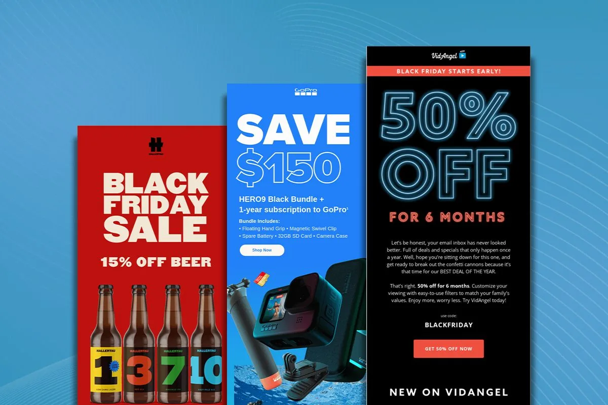
Promotional emails need to drive action. Your design should create a clear path from opening the email to clicking through to your offer. The layout should tell a story that builds excitement and urgency.
Color psychology plays a bigger role in promotional emails. Using your brand colors strategically can help highlight offers and create emotional connections. Don’t be afraid to use contrast to make your call-to-action buttons stand out, they’re the most important element in promotional emails.
Product images deserve prime placement in promotional emails. Show your products in context when possible. A furniture piece in a beautifully styled room will connect better than the same piece against a white background. If you’re promoting services, use imagery that shows the benefits or results customers can expect.
Transactional Email Design
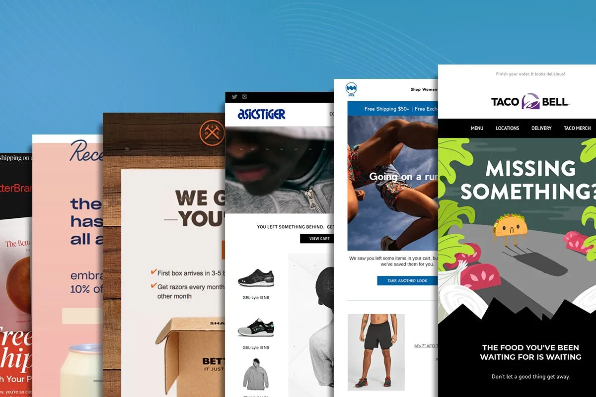
Transactional emails might seem purely functional, but they’re actually prime opportunities for brand building. These automated messages, order confirmations, shipping updates, password resets, often have higher open rates than marketing emails.
Keep the design clean and focused on the key information. Order confirmations should make the order details immediately visible. Shipping updates should highlight tracking numbers and estimated delivery dates. But don’t stop there, add value with related product recommendations or helpful content that makes sense in context.
Use design elements to build trust in these emails. Your brand colors and logo should be present but not overwhelming. Include security badges or trust signals when relevant. Make contact information easy to find in case the recipient needs help.
Testing and Optimization
Email design isn’t a set-it-and-forget-it process. Success comes from constant testing and refinement.
The Art of A/B Testing
A/B testing helps you understand what resonates with your audience. Test one element at a time to get clear results. You might start with your call-to-action buttons, try different colors, sizes, or text to see what drives more clicks.
Take time to test your templates across different email clients. What looks perfect in Gmail might break in Outlook. Tools like Email on Acid or Litmus can show you how your design renders across dozens of email clients and devices.
Pay attention to loading times. Large images or complex coding can slow down email rendering, especially on mobile devices. Test your emails on slower connections to ensure they load quickly enough to keep readers engaged.
Making Email Design Accessible: Tools and Platforms
Creating beautiful email designs doesn’t always require a full team of designers and developers. Modern tools have made it easier than ever to craft professional-looking emails, even if you’re not technically inclined. Let’s explore your options.
Ready-Made Email Templates
One of the simplest ways to start is with pre-designed email templates. These templates come coded and tested, saving you countless hours of development time. You’ll find templates for every purpose, newsletters, promotional campaigns, transactional emails, and more.
Most email service providers like Klaviyo, Mailchimp, Campaign Monitor, and Constant Contact offer template libraries. You can also find premium templates on marketplaces like ThemeForest or Template Monster. These templates typically include responsive designs that work across different devices and email clients.
The main advantage of templates is their reliability, they’re usually well-tested and follow email design best practices. You just need to customize the content, colors, and images to match your brand. The downside? You might find yourself somewhat limited by the template’s structure and design choices.
Drag-and-Drop Email Builders
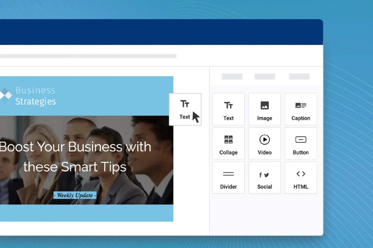
Email builders have revolutionized the way we create email campaigns. These tools offer intuitive interfaces where you can design emails by dragging and dropping different elements onto your canvas. Most modern email service providers include some form of drag-and-drop builder in their platform.
Tools like Stripo, BEE Pro, and Unlayer let you create custom designs without touching code. You can:
- Arrange layout elements visually
- Add and style content blocks
- Upload and edit images
- Customize colors and fonts
- Preview your design across different devices
The best part about these builders is their flexibility. You’re not locked into a specific template, you can create unique designs that perfectly match your vision. Many also include features like saved sections and reusable content blocks, making it easier to maintain consistency across campaigns.
Email Design Platforms
Some platforms specialize specifically in email design and offer more advanced features than standard drag-and-drop builders. These tools often include:
- Design collaboration features for teams
- Advanced personalization options
- Built-in image editing
- Code export capabilities
Integration with major email service providers
Platforms like Postcards by Designmodo offer pre-made modules you can combine to create custom designs. This gives you more flexibility than templates while maintaining the ease of use of drag-and-drop builders.
Hybrid Approaches
Many teams use a combination of these tools. You might start with a template, customize it in a drag-and-drop builder, and then make final tweaks in the code if needed. This flexible approach lets you balance speed, customization, and control.
When to Hire Professionals
While these tools make email design more accessible, there are times when professional help makes sense. Consider working with designers and developers when:
- Your brand needs highly custom designs that stand out from templates
- You’re creating a complex email design system for a large organization
- You need interactive features that go beyond standard capabilities
- You’re launching a major campaign where design quality is critical
Remember that even if you do work with professionals, these tools can help streamline your process. Designers can create custom modules for drag-and-drop builders, or developers can build template systems that non-technical team members can easily use.
The key is choosing the right approach for your needs, resources, and goals. Start simple with templates or builders, and scale up to more custom solutions as your email marketing program grows.
If you’re in need of professional email design and marketing help, consider scheduling a free consultation with In-box. We can help set up a campaign with design that pops and converts.
Real-World Case Studies and Examples
Let’s look at some successful email designs and break down why they work so well.

Fly by Jing’s Product Launch Email
This brand nails product storytelling through design. Their email features an unapologetically loud and fun aesthetic that matches their sauces perfectly. The design puts their product above the fold with a bold CTA button that makes conversion easy.
What makes it work: The visual hierarchy guides readers naturally from the product image to the benefits, then to the call-to-action. The brand’s personality shines through in every design element, from the color choices to the typography.
Ray-Ban’s Seasonal Campaign
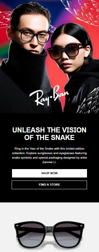
Ray-Ban’s email design proves that sometimes less really is more. Their campaign uses warm colors and a grainy, film-photography overlay to create a vintage vibe that perfectly suits their brand. The design feels both modern and nostalgic.
The layout keeps things simple with plenty of white space, letting the products take center stage. Each image links directly to its product page, making the path to purchase crystal clear.
Warby Parker’s Newsletter
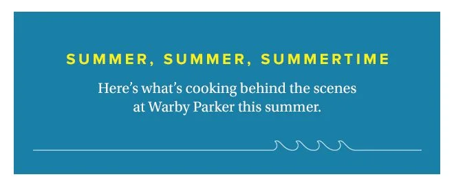
Warby Parker takes an artistic approach to their email design, using hand-drawn elements and a scrapbook style that sets them apart from competitors. This approach makes their emails feel more personal and crafted, matching their brand’s artistic sensibilities.
Their success comes from consistent branding across all emails while keeping each campaign fresh and interesting. They’ve found the sweet spot between predictability and surprise.
Best Practices for Implementation
Let’s talk about putting all these ideas into practice in your own email campaigns.
Creating Your Design System
Start by developing a clear set of design guidelines for your emails. This should include your standard colors, fonts, button styles, and spacing rules. Having these guidelines makes it easier to create consistent emails quickly.
Think about creating modular components you can mix and match. Header sections, product layouts, and footer elements can all be standardized while still allowing for flexibility in how you combine them.
Your design system should also account for different types of content. News updates, product announcements, and sale promotions might all need slightly different layouts while still feeling like they come from the same brand.
Quality Control Process
Before any email goes out, run it through a thorough quality check. This means testing links, checking images, and reviewing all copy. Pay special attention to how your design looks on mobile devices, that’s where most people will see it.
Set up a pre-send checklist that includes:
- Testing all links
- Checking image loading
- Reviewing mobile responsiveness
- Confirming all personalization works
- Verifying your unsubscribe process
Measuring Success
Track metrics that matter for design effectiveness. Open rates tell you if your subject lines work, but click-through rates reveal if your design is doing its job of guiding readers to take action.
Heat maps can show you where people click most often in your emails. Use this data to refine your layouts and button placement over time.
Looking Ahead: The Future of Email Design
Email design keeps evolving as technology advances. We’re seeing more brands experiment with dark mode optimization and interactive elements. AMP emails are gaining support across more email clients, opening up new possibilities for in-email experiences.
Personalization will become even more sophisticated. Machine learning tools will help predict which design elements work best for different subscriber segments, letting you automatically optimize layouts for better engagement.
The key is staying flexible and willing to adapt as new trends and technologies emerge. What works today might need updating tomorrow, but the fundamental principles of good design, clarity, hierarchy, and purpose, remain constant.
Remember that great email design isn’t about following every trend or using every new feature. It’s about creating experiences that connect with your audience and drive results. Start with these principles, test what works for your specific audience, and keep refining your approach based on the data you collect.